top of page
Design posters for Indie music shows
Sellotape

Sellotape is a pub in the Jezreel Valley that hosts monthly live music shows. The pub hosts various artists who perform songs from the genres of indie, rock, and Israeli music. This project was made as part of a typography course at Shenkar College.
About the Project
Design Elements
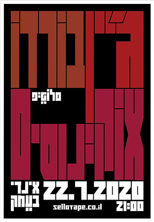
I started by designing the logo for the pub. After settling on a hand-sketch logo direction, I finalized it in vector format. I worked with a grid and created the square letters at the same width and structure. I added punctuation marks in two places, above and below, to make the logo look more comprehensive.
The visual language of the posters derives from the pub's logo and is influenced by it. The letters are square, sitting within a clear grid and forming rectangle structures.
There are two wide-designed banners, in which bands that the pub wants to focus on are presented. In addition to the scrolling text that provides background and information about the band, I took the rectangular structure of the letters I created and used them in the logo and previous posters, and broke the grid to create a perspective effect.
The final poster in the series is actually an annual event schedule. In the animation of the cube, which forms the title, logo, and the pub's website address, I wanted to create a construction and deconstruction of the grid, achieved through the revealing and hiding of letters and words. The three-dimensional element of the rotating cube creates perspective and connects to the two wide-designed banners.


See also:


bottom of page